
Creating a distinctive and eye-catching book cover is critical for any author or creator looking to self-publish their work. Despite the overused cliche, “Never judge a book by its cover,” a well-designed cover can make all the difference in capturing readers’ attention and selling your book.
Because your book will undoubtedly be judged by its cover, it is absolutely important that you make a compelling first impression. A great visual impact encourages consumers to pick up your book and assists in communicating its tone and content.
When designing a book cover, you can be as creative as you want, but there are some essential best practices you should follow. So, before you open Photoshop, InDesign, or Canva, let’s go over some professional tips to ensure your project’s success.
Three Things You Should Know About Book Covers
There’s no doubt that you want your book to stand out among other titles in its genre. This requires a visually appealing cover design that captures the attention of target readers and piques their interest.
Before we get into the how-to tips for your book cover design, there are a few hard and fast rules to follow. But do not worry. Designing isn’t necessarily a project to pursue alone. Sure, you can take the creative lead, but it’s critical to conduct research ahead of time and hire the right help as needed.
The Book Covers: We All Judge Them
According to one survey, 79% of people claim a book’s cover influenced their decision to buy it. While this may put you under pressure as a creator, the fact that most of us judge a book by its cover can be a chance to leverage.
We humans are biologically wired to absorb visual elements in order to determine our own likes and dislikes. Images, colours, and designs immediately stimulate our brains. We are naturally drawn to beautiful books and must consciously reject poorly designed books in order to give them a second chance.
There is no doubt that people will judge your book cover within seconds of seeing it. The idea is to take advantage of that inevitable judgment as an opportunity to capture readers’ interest and entice them to read your book.
Hiring a Book Cover Designer Pays Off
There’s a reason why most self-publishers seek the assistance of an expert book cover designer. Most creators aren’t designers, but there are many skilled professionals who are.
We don’t mean you shouldn’t design your book cover. However, if you’re serious about creating a high-quality product that stands out in your book genre, hiring an experienced designer helps to ensure that your vision is accurately and effectively realised.
Reedsy, Upwork, 99designs, and Guru are great places to start for finding creative talent and freelance opportunities. Depending on the artist’s prices, a professionally created book cover will cost between $250 and $800+. However, if your goal is to publish a successful final product that stands out in a bookshop, this investment might be quite profitable.
It is Smart to do Market Research
To create a unique cover that appeals to your target audience, you must conduct market research within your book genre. This includes analysing best-selling books in related categories, as well as understanding current trends and reader preferences.
By researching the market, you can acquire insight into what draws potential clients. This essential knowledge can spark book cover design ideas. You could begin by:
- Browsing top-selling books in your genre on Amazon or Goodreads. Take note of any common themes or styles across multiple covers.
- Visit bookstores and libraries to observe popular titles, paying attention to their design, colour schemes, and typography choices that stand out on the bookshelves.
- Research current book cover design ideas and trends to understand what’s in right now. Some of the most popular trends in 2023 are bold typography and loud maximalism, nature-inspired images, parametric patterns, and conceptual cover sleeves.
Tips for Designing a Professional Book Cover
Whether you choose to collaborate with an artist or do it yourself, you are the creative director of your book cover’s design. So, how do you put all of these aspects together to bring your book cover concept to life?
These are steps that professionals use when designing a book cover; you can follow them as well.
Get Inspiration for your Book Cover Design
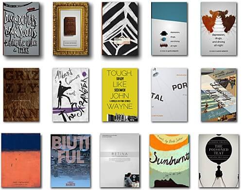
Exploring various book covers as part of your market research will offer you an abundance of creative inspiration. Browse Amazon’s Best Sellers or visit websites like Book Cover Archive. Expose yourself to hundreds of professional book covers and see what catches your eye. Analyse the elements that make specific covers visually appealing and memorable while conveying their actual message.
Take this a step further by looking at covers for popular books in your genre. What do you like and dislike about the books in your space? How can you distinguish your books from others that have recently been published?
As you take notes, keep in mind that you are not trying to replicate what others are doing. Instead, it’s all about creative positioning and planning a cover that will stand out on the shelf.
Outline your Book’s Central Themes
A well-designed book cover gives potential readers a glimpse of the contents while leaving them wanting more. Identify and outline your book’s central themes or motifs to inform your book cover design ideas and concepts. The end result should connect the visuals on the cover to the content on the inside pages.
Now it is your time. What emotion or mood do you want to evoke based on the main themes of your book? What message do you want to convey? What type of visuals would best capture the true essence of your book?
Outlining your book’s primary themes influences your colour, imagery, design, and copy selections. These combined features provide prospective readers with a clear and inspiring impression of what your work is about. This process can assist in jumpstarting your book cover brief.
Prepare a Book Cover Brief
Like a creative brief for a logo or the article’s content brief, your book cover brief serves as a helpful guidepost for the design process. In essence, a book cover brief documents the fundamental information about your book and the boxes that the cover should tick.
Your book cover brief might take a variety of shapes. However, a few key elements will make your brief the most useful to your designer, whether it is you or someone else!
Here is what you should include:
- Specify cover dimensions and cover details, such as book type, cover type and any unique design elements. Always specify where your book’s barcode will live!
- Design suggestions such as brand identity elements, mood board inspiration, colour palette, and details that will improve the book’s visual appeal.
- The specific copy you want to include, such as your name, book title, subtitle, tagline, reviews, and crucial content. Consider your spine, flaps, and back cover; you may want to incorporate accolades and an author bio.
- Provide an overview of the book’s genre, target audience, and market demographics.
- Provide background context, such as a synopsis or short overview of the book’s themes and main characters.
- Specify your deadline, budget, and feedback/check-in dates.
- Share Examples of book covers you love and dislike, along with an explanation of why behind each.
This brief is an essential communication tool when working with a designer. However, if you have your own book cover design ideas, it might serve as a framework to help keep your design project organised.
Consider the Visual Hierarchy
Visual hierarchy refers to how our eyes perceive distinct items based on size, colour, contrast, and alignment, helping us to process information more effectively. When designing your book cover, sketching each element’s general size and location can be beneficial.
To apply this principle when designing a professional book cover, ask yourself a few questions:
- What is the most important? Decide how to prioritise critical components such as title, author name, and images.
- Where do you want your reader to look next? Use this to achieve balance through symmetry or asymmetry, depending on the intended mood or tone.
- How can you use colour and white space to highlight what’s important? Use contrast to make key elements stand out from the background.
Deciding on your visual hierarchy and sketching out your cover’s balance, contrast, and genre-specific elements allows you to create an eye-catching book cover that effectively conveys your story’s essence. Stay true to your genre and personal aesthetic while experimenting with design elements in order to create a cohesive visual identity for your work.
Choose your Font and Colours
Choosing fonts and colours that complement each other while staying consistent with your book’s overall theme or mood is an integral part of designing an appealing and readable book cover. When making these decisions, keep legibility in mind. After all, what good is a text that you can’t read while deciding whether to buy a book?
When choosing a colour palette, consider contrast as well. Online contrast checkers can help you make your cover accessible to everyone, especially those with visual problems.
Choose your Fonts According to Readability and Style
The right font can significantly impact how your book cover looks. It should be readable even at smaller sizes, such as thumbnails, while still reflecting the tone of your content.
When choosing a font, consider both print and digital compatibility, as well as the genre of your book. Serif fonts are popular for classic genres such as historical fiction or nonfiction books, sans-serif fonts for modern or minimalist designs, script-style typefaces for romantic novels, and so on.
Evoke Emotion with your Colour Scheme.
Colours play an essential role in creating the tone for your book cover design. Different colours can elicit a variety of emotions, so selecting a colour scheme that corresponds to the themes of your story helps create an impactful visual representation. For example:
- For mystery/thrillers, darker tones such as black, grey, and deep red may be appropriate.
- Romantic: colours like soft pastels and warm tones evoke feelings of love and passion.
- In fantasy/sci-fi, vibrant colours and or metallic accents add excitement to fantastical worlds.
Beyond the primary colours of your design, contrast is also important. For example, if your cover has a dark background image, use lighter font colours for text to improve readability.
Make your Title Stand Out!
An eye-catching title can make all the difference between someone picking up your book and passing it by. Choose fonts that highlight keywords without overwhelming readers with a cluttered design.
Increase the Font Size
You’ve already chosen the typography for your cover; now it’s time to play around. Making your title’s size up all the way helps your cover stand out from a distance. Try using bold, italics, and underlining. What makes your title jump off the shelf?
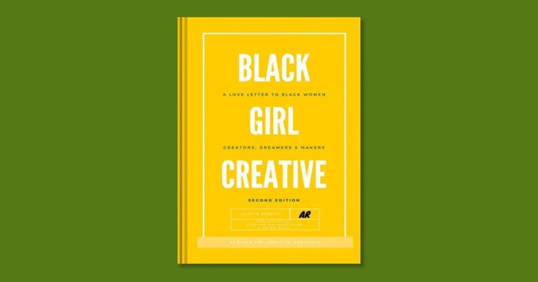
Alecia Renece’s Black Girl Creative Manifesto is an excellent example. She chose an authoritative, clear title font and increased its size almost to the maximum. She bolded and centred the title and interspersed her book’s subtitle between each word in a smaller, black, unbolded font. It’s a great example of using size to highlight keywords and catch attention without sacrificing readability.
Let your Title Breathe
Beyond selecting an appropriate font style, balancing text size with other aspects of the cover is critical. White space is a great way to make your content easy to read and stand out from its background.
As you continue to design your cover, keep track of how much text will fit in each space; this will help the design appear balanced and provide plenty of breathing room for your readers. Return to your visual hierarchy plan and analyse the negative space around your title. Where are you attracting the attention?

I’m Here, by Juan Camillo Garza, is an excellent example of text and spatial balance. Garza conveys the book’s serious mood by using a hollow, black-and-white font that complements the illustration. He then uses an extensive amount of negative space to emphasise the title and his name.
Here’s what you need to keep in mind while choosing your title.
- Keep text minimal. A clean, concise design engages readers effortlessly. When in doubt, choose fewer words and more visual elements. If your title is lengthy, shorten your subtitle.
- Experiment with your visual hierarchy. Arrange each element on your cover in accordance with its importance. If your title is the most crucial, make it the focal point of your design. If your name grabs attention, let it take up more space than a photo.
- Use lots of negative space. Allow enough breathing room around each text element so nothing feels tight or cluttered. Providing proper spacing between lines of text improves legibility and creates a more visually pleasing design.
Remember your Book’s Spine and Back Cover
It’s easy to ignore spine and back cover details while focusing primarily on the front cover. However, these parts provide valuable real estate opportunities for creator bios, industry professional endorsements and reviews, book summaries, and other information that may persuade consumers to start a book.
Design an Engaging Spine
The spine of your book is frequently the first thing potential readers notice while exploring a bookstore shelf. So, make it count! Your spine should be visually pleasing while still conveying important information about your book.
Here’s what you should remember.
- Choose a legible font. To ensure consistency, pick a clear typeface that matches the style on your front cover. Increase the size for clear, easy-to-read text that can be read from a distance.
- Place your title front and centre.Make sure your title and subtitles are prominently placed on the spine and are easy to read even from a distance. (This is so vital, we mentioned it twice.)
- Enter your name. While your title is most significant, readers also want to know who you are.
- Keep text and visuals balanced for a clean, impactful design. Keep things simple! Avoid cluttering and embrace simplicity for a clean spine design that’s easy to read and visually appealing.
- Use contrasting colours. Make sure the colour of your text stands out from the background of your spine.
Effectively use your Back Cover Space
Your book’s back cover design is critical in encouraging potential consumers to buy your book after they’ve taken it up off the shelf. It also offers most of the space for text and other information, so there’s a lot to think about.
While the majority of these elements are optional, there are several best practices for maximising the use of your rear cover.
- Write an appealing blurb or synopsis. Summarise what makes your narrative unique without giving away any spoilers. Your book blurb should catch readers’ interest while leaving them wanting more.
- Add your bio and photo. A quick introduction to the author and an on-brand photograph enables readers to connect with you on a personal level.
- Add endorsements and reviews. If your book has earned appreciation from industry professionals or other published authors, incorporate these quotes as social proof of its excellence. You can even include reviews from Goodreads or Amazon if you already have a book out.
- Mention any awards or books. If your book was honoured with a notable award, or if you’ve authored other books, make sure to include them as well! It builds credibility and encourages readers who have never heard of you to take a chance.
- Use relevant visuals. Use images complimenting the front cover design and give context to prospective buyers.
- Remember your barcode and ISBN. Many printers have a certain location for your barcode, and ISBN must be.* Keep this in mind when designing your back cover.
Taking the time to design your spine and back cover carefully enhances your chances that readers will pick up and purchase your book as they browse the shelves. Give yourself plenty of time to experiment with your designs.
Get Feedback
Whether you designed your book cover yourself or hired a professional, getting feedback on the final design is important. Seek honest feedback from acquaintances, peers, and industry professionals. If you’re not sure where to start, join online forums and ask other self-publishers for advice and opinions! The more points of view, the better.
Listen to each suggestion and incorporate relevant feedback into your final design before publishing. Before listing your book in bookstores, you should print a single proof to double-check that your cover (and book interior) are picture-perfect.
Get Started Today!
Creating an eye-catching book cover is vital for any self-publisher trying to sell their work. You may create a book that will entice readers browsing store shelves by utilising the power of research and thoughtful design decisions on the front and back cover.
After reading this article, we hope you feel more confident in designing your book cover. So, what are you waiting for? Create a stunning cover to help launch your book into the world.
FAQ’s – Frequently Asked Questions
1. What are the essential components of a book cover design?
A good book cover design includes elements such as an eye-catching title, engaging imagery, and a cohesive colour scheme. The typography should be clear and readable, and the overall layout should mirror the genre and tone of the book. Additionally, consider adding your name and a tagline or subtitle to enhance the design and provide context for potential readers.
2. How should I choose a suitable book cover colour scheme?
Choosing a colour scheme involves understanding the emotions you would like to evoke. Consider at color psychology to match the theme of your book. Choose opposing colours to guarantee that the text is clearly readable and stands out. Harmonious palettes can be created with tools such as Adobe Colour. Always test your colours in different formats to be sure your colours look great in print and digital media.
3. Should I hire a professional designer for my book cover?
Hiring a professional designer will significantly improve the quality of your book cover, particularly if you’re not sure about design principles. A skilled designer can create an aesthetically pleasing cover that draws readers by understanding market trends. If you are on a budget, you can use design tools to make your cover while following the best practices. Just be sure it adheres to the standards of the industry.
4. How important is typography in book cover design?
Typography is extremely important for book cover design because it captures the genre and tone of the book. A well-chosen font could highlight the title and improve readability. Experiment with several weights, sizes, and designs to create a visual hierarchy. Make sure the book’s text complements the overall design without overwhelming the imagery, making it easy for readers to identify the book at a glance.
5. When creating a book cover, what typical errors should I avoid?
Typical mistakes to avoid are using poor-quality images, cluttering the design with too much text or images, or ignoring the spine design. Your text should align with the genre of the book and be readable from a distance. Furthermore, don’t overlook the value of professional suggestions; gather opinions from others to find areas that need improvement and ensure that your cover appeals to your target market.