What is the most essential marketing tool for books? Some believe it is the publisher’s distribution channel. Others will say it’s a book copy. And then some claim it’s the book’s cover.
According to The Booksmugglers, “People buy books by their covers“. We’ve probably heard this a million times, so there must be some truth to it. Right?
A book’s cover is undoubtedly a first point of interaction with prospective readers. If designed attractively, your book cover can make a lasting first impression and invite readers in; however, if it’s the opposite, it could also be the last. For book authors and publishing marketers, here are some statistics to support this theory and a helpful design strategy.
What Does a Book Cover Actually Do?
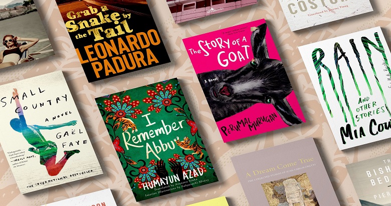
A good book cover should quickly capture readers’ attention, be stunning, striking, clean, and professionally designed, and also let the readers recognise the primary genre instantly. They’ll also often convey the main character’s age and gender, as well as the geographical location. So, besides being visually appealing, the most effective (and thus most popular) types of book cover design layouts will feature the main character, without necessarily exposing their face, with a famous city or landscape in the background.
Then, to ensure that readers readily recognise the genre, they will choose fonts and colours that match the general design standards for that genre. An effective book cover will also resemble other best-selling books in the genre. Not identical, but “sort of like” some other well-performing books in the genre. This will help readers recognise and subconsciously think, “This book reminds me of those other books in this genre I liked…” I think I’ll buy it and see if I like it.”
That is what a successful book cover does.
Why Are Some Genre Book Cover Designs So Similar?
So, it should be expected that all genre’s types of book cover designs covers will look pretty much the same.
All European thrillers will feature big, bold, dirty fonts, a European city, and, most likely, someone running. Maybe a gun.
All hard-boiled LA detective books will likely include palm trees, a gun, and some blood.
All chick lit will be light blue, pink, or purple, with curly letters that feel lovely and simple.
All vampire romances will have sharp, gothic typefaces, primarily red and black.
This does not make them a cliché. Sure, when you compare a few carefully chosen ones side by side, there will (and should) be more similarities than differences. For example, if you’re strolling down the aisle at the store, you’ll recognise the cereal boxes because, even though they are all different, they also all kind of look just the same. You know what they contain. You know you’re in the right section.
So, you pause and turn the box over to read the contents.
Humans have particular emotional responses to different colours. Red evokes excitement and energy, making it ideal for creating suspense and intensity in thriller covers.
Does The Cover Influence the Reader?
In a survey conducted by The Booksmugglers, people were asked the following question: Has a cover ever been the sole driving force for you to buy a book? 40% of those questioned said “Yes!” That is impressive. Almost every second reader purchased a title only because they liked its cover.
Another question that might draw your attention is: In your opinion, are ‘cliched’ genre fiction covers useful? Do you believe they signify or inspire a sense of reader familiarity, encouraging people to purchase the book? Two-thirds of the responders said, “Yes!”
What do these responses teach us? First, the cover is one of the most critical factors in book sales. It is the first tool in our marketing toolkit, a powerful one, period.
Second, buyers should be able to identify the genre as soon as they hold a cover in their hands. Why? We as humans prefer things that we are familiar with, which we can put into categories. If people can associate our book with a genre without reading a single word of our copy, they may already have a subconscious decision to like it before actively reading anything specific about the title. A cover that adheres to well-known genre standards makes it easier for readers to purchase.
If you are working in book marketing, you might have always believed that the most important thing was to stand out. But actually, authors must find a balance between distinguishing themselves and adhering to given standards.
One method for identifying these design characteristics for each genre is to use The Airport Method.
Finding the Right Elements for Your Cover Design
Have you ever been to an airport bookshop? They are often cosy and intimate, with carefully curated shelves that highlight a select collection of books. As a result, thrillers are placed among a couple of romantic novels. For our creativity exercise, blurring sections is beneficial.
We want to identify recognisable design characteristics for each genre. They contribute to creating a cover that future readers can easily classify, allowing them to determine whether or not to take a closer look.
Follow this technique using The Airport Method:
- Take a step in front of a shelf, but try not to look at the books immediately. Allow yourself to explore without knowing the genre you’re diving into.
- Squint your eyes until your vision is slightly blurry.
- Turn your view to the shelf.
- Look at the cover and try to identify the genre while keeping your eyes nearly closed.
- Once you’ve identified the genre, try to name the design elements that led you to put the cover into this genre.
- Open your eyes and evaluate your analysis.
Of course, you may find examples in each genre that do not adhere to the general framework that you have defined. When you come across titles that you can’t categorise right away, set them aside and take a closer look at the covers later.
The good news is that these outsiders can serve as inspiration for how to dance out of the lines. They show you how to diversify your cover within your location. Perhaps this is the first biography that does not feature the celebrity. Maybe it’s one of the few romance novels that use dark colours.
This is crucial because:
- Covers are our initial marketing tool. They determine whether or not readers take a closer look at a book.
- Readers subconsciously decide if they like the title or not based on its ability to classify into a known genre.
The Airport Method is one way to figure out how your cover should look. You may even use it at bookstores or squint your eyes when browsing Amazon.
Hopefully, this strategy will help you get started on designing your cover. At the very least, it should give you an idea of what other authors are doing and what the characteristics of your genre are. And that’s already an advantage because it’s one of the most essential marketing tools in the book publishing industry.
Focus on making your book cover stand out, but don’t stress about being different just for the sake of it. Prioritise stunning, professional design that truly represents your book. Getting feedback is always a good idea, as authors may not always have the clearest sense of what makes a high-quality design. If you’re considering designing the cover yourself, consider whether it’s the best approach, as it can be challenging.
Ensure the cover design, title, and subtitle provide all of the information readers require so they do not have to read the summary to get answers or to find out what the book is about. The book’s genre should already be evident from the cover; the description details are intended to push interested readers over the edge.
FAQ’s – Frequently Asked Questions
1. What types of book cover designs are most effective?
The most effective types of book cover design include those that are visually striking and genre-specific. Best-selling book cover often features bold images, clear typefaces, and colours aligned with the book’s idea. They should grab readers’ attention right away and provide important book-related information so that they can quickly identify the genre and content.
2. How can a book cover affect sales?
Being the first point for interaction with possible readers, a book cover significantly affects sales. The right types of book cover design can appeal to readers and increase their chances of picking up the book. Surveys show that cover art significantly influences readers’ decisions on book purchases, highlighting its importance in marketing.
3. What role does genre play in book cover design?
Since it establishes readers’ expectations, the genre is significant in book cover design. Different genres have different visual designs that are among the best book cover designs for drawing in the appropriate target market. Thrills, for instance, can have darker tones and strong typography, while romance books usually have softer colours and whimsical designs so that readers might instantly know the genre.
4. Should I design my book cover considering trends?
Considering current design trends can be beneficial when creating your book cover. Following genre standards is essential, but adding popular elements will improve the visual appeal of your cover. The most effective types of book cover design usually combine classic designs with contemporary trends to make the book feel fresh and relevant to possible readers.
5. How can I make sure my book cover is unique?
Emphasise originality while following genre guidelines to guarantee your book cover distinguishes itself. Create striking designs using unique imagery, compelling typography, and a striking colour scheme. The most effective types of book cover designs will combine familiarity with creativity to let your book grab readers’ attention while still being relevant to the intended readership.


